A good logo will always be recognizable but a great logo is timeless. When designing or creating a brand for your company having a logo is probably one of the first things you think about; everything from text, symbols, and even color. But the best logos in the world aren’t only easily recognizable, they’re also timeless.
Think about some logos off the top of your head. Immediately you’ll think of logos that have been around for quite some time and haven’t changed throughout the years. Sure, they’ve been changed here and there but the general design has stuck. But we’re not here to recount the history of logos. We’re here to find out why and what makes logos timeless.
It’s Overrated

First thing’s first, regardless of what type of logo you’re using or going to use, whether it’s a wordmark, an icon, or an abstract image, logos are inherently meaningless and a little overrated. At least that’s what Graphic Designer Michael Bierut thinks, and with good reason.
Logos by themselves don’t really do anything to make one’s business more recognizable or more popular than the other. What makes a logo work fantastically for a business is how well it can be used to associate the company’s services or products via marketing or labels on the product itself.
A good example of this is Nike. Nike has marketed their logo so well not just on its products but on commercials, billboards, and a plethora of other things to make us associate athletic performance with Nike. Another good example of a timeless logo is the Apple logo. Sure, it’s changed from the rainbow apple to a nice chrome apple, but the logo is so recognizable due to how well they integrated that logo into their company marketing as a whole.
Once you know what you want to do with your logo, then you’ll find success in making the face of your brand memorable.
So how do you make a logo that’s timeless?
Keep it simple
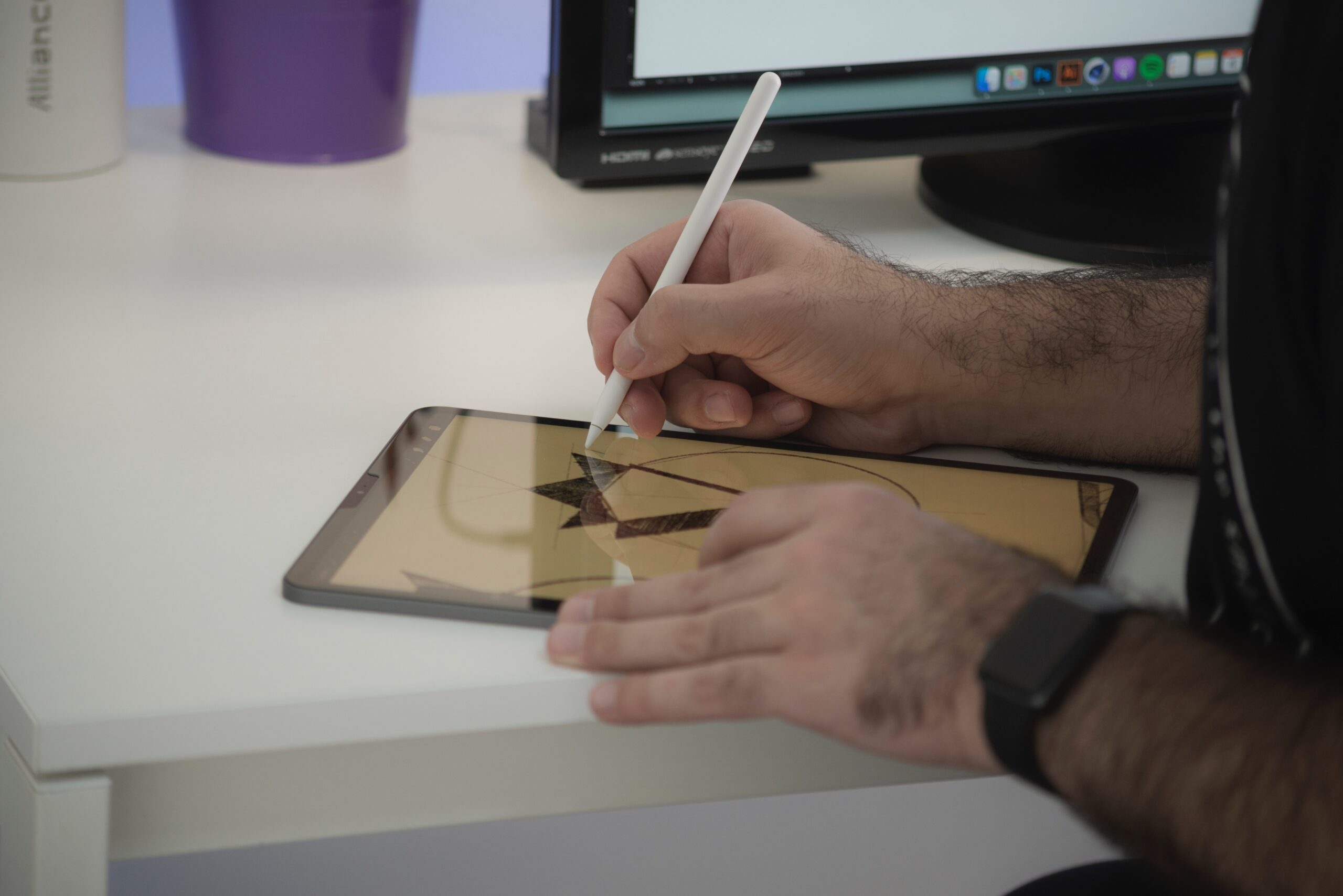
When it comes to making a logo, you want to keep it simple. Because customers won’t hone in on a logo, if anything they’ll just look at it for less than a second before looking away, and with that in mind you really can’t have a complicated logo.
You have to make sure the logo is simple enough to catch someone’s attention while making sure you’re able to convey what your company does as well as its personality in that split second of attention. Some great examples of this are Disney’s simple and whimsical wordmark which showcases the magical world of Disney, McDonald’s with its iconic golden “M” which shows the happy vibe they want to portray, or the Twitter bird which showcases their mascot while harkening back to “tweets”.
Make it relevant
There are plenty of ways to tie your logo into what your business or product does, and even your target market. For example, Playstation’s logo is a racetrack that makes the letters P and S. This not only shows Playstation’s initials but it also illustrates that the product is about games.
Another good example is courier services logos, which typically depicts trucks, boxes, or mails. They are able to tell a story that clearly communicated the company’s products and services. Point is, whether through abstract design, color choice, or imagery you can find many ways to tie what the business or product is about to the logo. This leads us to our next point.
Develop it to be flexible
Here we have logos that are so easily recognizable that no matter what you do to them, it will still be recognizably your logo. These are called logo systems. Basically, you have a single static logo that serves as a graphical framework that can shift and change to anything you want while still keeping the base framework.
Examples of this can be the MTV logo that they changed up graphically through video commercials. Google also does this whenever there’s an event or holiday to be celebrated. Having a flexible logo means you have several chances to catch the customer’s attention by playing into what is recognizable and then putting an interesting spin to it.
Create it to be a classic
Finally, if you want a logo to last a lifetime, a logo that can be refined but not completely changed, a logo so recognizable that it’s ageless, then you’re going to need a logo that you’re willing to stick with.
This is because when you want to make a logo timeless, you have to avoid designs that can easily become dated such as following fads or trends. While there isn’t anything bad with following a trend, it’s important that your design is able to take what makes these trends “trendy” beyond a surface level and apply it to your logo.
Logos that stand the test of time typically focus on the basics, like colors, font, and simple design features. If you want good examples of this just take a look at the logos of fast-food joints, Pepsi, Coca-Cola, or the logos of TV Channels.
At the end of the day if you really want to make your logo recognizable, attention-grabbing, and timeless then it comes down to good design and good marketing. A well-designed logo can be the face of your business for decades but it’ll only be as good as you make it.

