To the average customer or audience, a company’s choice of branding isn’t something they focus on since people usually won’t dissect or analyze a logo. But what they don’t know is that these logos have more of an effect than we give them credit for.
Any designer worth their salt knows that there’s a lot more that goes into a logo than just picking what shape or color they like the best. It’s important to understand how the anatomy of a logo works and the importance of good design in business.
That’s why we’ll be looking at logos at a much deeper level, touching on the psychology of shapes, the reactions each elicits, and why it should matter to you.
Shapes and How They Work
Many elements make up a logo, and the very foundation of that is the shape.
So, forget about making a logo purely based on aesthetic preferences, because the shape you pick can fundamentally change how your audience sees your company.

Research on visual communications shows that shapes evoke different responses in the human brain, which helps amplify an intended message for your audience. While there are other elements, such as color, font, and imagery, the shape that you chose establishes its foundations and helps drive your brand message forward.
The following list goes on to explain different shapes and how they can impact your logo.
Geometric Shapes
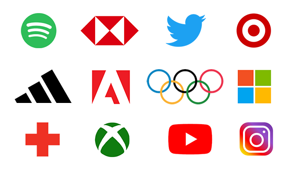
Geometric shapes are by far the most common shapes used for logos and with good reason. These are familiar to us and therefore evoke a clear visual impact on consumers.

For example, circular shapes are a popular choice because they can be a sign of continuity and perseverance. They can help convey a sense of femininity, community, harmony, and security. This is because the roundness of the shape, paired with its lack of points, make it distinct from other shapes and makes it look soft and appealing.
Square and rectangular shapes on the other hand convey a sense of stability and balance in the human mind. These are also often associated with strength, efficiency, and professionalism. You’ll mostly see these shapes used as logos for banks, corporate businesses, and companies that want to convey a sense of security and reliability.
Finally, triangular shapes are associated with dynamic movement, ingenuity, as well as mysticism, and the arts. This can be very powerful and playful depending on how the shape is positioned. For example: having the point upward can help you convey stability and power while having the point downward can give your logo a feeling of energy and purpose. On the other hand, having the point go sideways expresses feelings of movement, speed, and action.
Abstract Shapes
Unlike the familiarity of geometric shapes, abstract shapes can defy the rules and allow you to creatively define your brand. This is because abstract shapes can inspire a variety of ideas or feelings that can be multi-layered or one-note.

Take for example the Nike Swoosh, whenever people look at the logo they associate the brand with the idea of sports, activity, and speed. Meanwhile, the Playstation PS logo helps convey feelings of creativity and fun.
Of course, the logos alone can’t take all the credit when it comes to abstract shapes, because we associate these feelings with them through clever use of marketing. However, that is another strength of abstract shapes. Because of their uniqueness and versatility, you can fit abstract logos anywhere and creatively use them however you want in your branding.
These designs are perfect for catching your audience’s attention and making them interested in your product or service.
Line Shapes
Much like abstract shapes, lines can offer unique flexibility and customization because their orientation can shape the way we perceive that logo.

Vertical lines, often used in the music industry, can invoke feelings of strength, energy, power, and fun. On the other hand, horizontal lines are more tranquil, stable, and calm. You’ll see these lines used by tech-based companies. Vertical lines can also trick your eyes into thinking the logo is narrower than it is while horizontal lines make them look wider.
However, there is another set of lines that can dynamically change how your logo is perceived — curved line shapes. Unlike horizontal or vertical lines, curves showcase feelings of movement, rhythm, motion, happiness, and positive emotion.
These shapes are great at conveying warm feelings and are perfect if your company is looking to form a connection with your audience. If you don’t believe that, just take a look at Coca-Cola and Disney. Both of which have a strong emotional and personal connection with their consumers.
Why Does it Matter
The importance of good logo design in your branding is its ability to convey or enhance your message without needing to explain your sales pitch to the consumer. A good design can help you effectively market yourself while making it appealing and memorable.
While it’s not the be-all and end-all of branding, your logo designs are important for presenting yourself to consumers. It creates associations, feelings, and intrigue in the human mind, attaching meaning to your brand, and aids audience retention.
